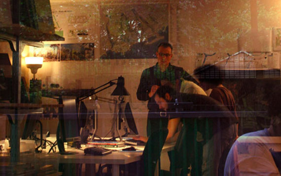
 [Window into the OLM studio]
It might be fair to say that for those unfamiliar with landscape architecture the idea of "what we do" is often obscure, and understandably so, as we've found, many LA's aren't quite sure what they do either.
That's why its so important to create a transparency from the studio to the outside world, to give everyone willing an inclusive look and understanding that design is a process and that landscape is not an afterthought. Better understanding may lead to a greater want, and thus, more work.
Unlike many design shops such as IDEO and Adaptive Path, landscape/architecture studios have been rarely successful in exposing who they are and how they do what they do. Instead so often we get the ubiquitous photo of three or four staff members leaned over a table and drawing "engaged" in the process. Accompanying this might be a descriptive paragraph with words thrown in such as "listening" and "inspiring" but shows little as to how that's done. With easily accessible technology, I think we can be more creative.
These thoughts came after viewing a video by The Office of Lanscape Morphology, a landscape architecture studio in Paris, which simply introduces the cast of staff and shows them in their native habitat, emerged in the process of design. Their site is a bit clunky, but I think the video is a particular fine example of how new media can open studio windows to the public eye.
