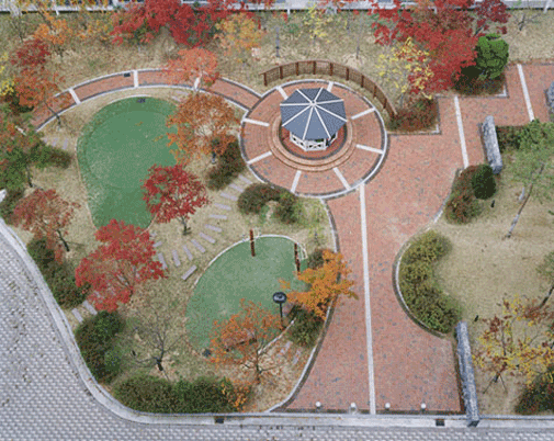
 {Image: "Howon Dong" photos by Hosang Park, from his series A Square}BLDGBLOG recently showed us photographer Hosang Park's A Square, which depicts small urban landscapes photographed from above, which Park suggests, noting a graphic aesthetic, is the way in which they were designed, perhaps in a vacuum, only from above. The images inhabit not a single person, theorizing a lack of success due to a design which neglected the true role of a park and an understanding of the human experience and scale.
While I'd rather not comment on the designs themselves, for one, I know nothing of the designers intent, two, I've haven't experienced them physically, and three, the fitting in of the "program" elements based on a clients wishes is something that is prevalent in landscape architecture, and I assume other design professions.
It comes from this, a developer/client, for whatever reason, often as Nicola reasons is to accommodate an open space requirement, develops a list of program elements which they would like incorporated into the design. This is usually followed by a desire for the 100'x100' square foot space, no where near "nature" mind you, to have a "natural" feel. Hence were given "natural" curvilinear paths, winding around tot lots and basketball courts, and putting greens which are never used. A study of what the space needs to be is never done, so you end up with the rubber stamp of program elements.

 {Images: "Singbong Dong" and "Samsung Dong" photos by Hosang Park, from his series A Square}
LA's are not innocent on this one either. There is validity in Park's claim that too often designs are created only through the plan view, with a lack of intuition into the user's actuall spatial experience. From above, the shapes and graphic connections drawn have merit, but only in the 2D design sense, and a compelling paving pattern viewed from above may become meaningless to one walking along it.
We've also become far too reliant on our default placement of objects d'art. Your design creates a central circular area, what do I place in the center? A fountain of course! What does the fountain do? It's a focal point. A focal point from what or to what we're not sure, but we've been slowly brainwashed to believe that we need them in the design. When you have a shape or space with a center, we have to place something there.
Some would argue, this is what the developer wants, they want a fountain, they want the tot lot, they what "natural", so that's what we must design. There is logic in this, and in many circumstances there's no way around it. But we as designers need to also be teachers to our clients. We are supposedly the the creators of the most innovative methodologies, and clients "don't know what they don't", so we should always be educating and pushing what we feel is the necessary program makeup for the design.
 {Image: "Uman Dong," photos by Hosang Park, from his series A Square}
 {Image: "Jangan Dong", photos by Hosang Park, from his series A Square}
Park explains, these "parks" are too small to serve their ostensible purpose: as open space for recreation and places "to make discussions or take a rest." I don't agree with Park's assumption that in this case "size matters" in regard to the success of a park. There are several examples, Paley Park in NYC for one, that provide all which he believes a park is intended for with very limited space. But, lack of space necessitates creativity, and if ill-programmed and ill-designed, an empty park is inevitable.
